In this Photoshop tutorial, we’ll learn how to match the color of an object in one photo with the color of an object in a separate photo using the Match Color command, which has been available in Photoshop since Photoshop CS (which means you’ll need at least Photoshop CS if you wish to follow along with this tutorial).
Here I have an image, taken from a catalog, of a model who’s obviously quite happy with how well the color of her new top matches the outdoor setting she finds herself in:

The original image.
As with most items of clothing, that same top is also available in other colors. For example, let’s say it’s also available in the same color as the top the model is wearing in this photo:

A model displaying a purple top.
The client would like you to change the color of the woman’s top in the first photo so that it matches the color of the top in the second photo, like so:

The color of the woman’s top in the original photo has been matched to the color of the top from the second photo.
Personally, I like the green color better, but hey, whatever the client wants, right?
Photoshop’s Match Color command was created specifically for this type of task, although it does have plenty of other uses as well which we’ll look at in other tutorials. However, depending on the images you’re using, Match Color doesn’t always work perfectly on its own. Sometimes it does, sometimes it doesn’t. Sometimes, it needs a little help, and as we’ll see in a moment, this is one of those times. Let’s get started!
Step 1: Duplicate The Background Layer In The Original Image
The first thing we always want to do when working on an image in Photoshop is duplicate the Background layer. The Background layer contains our original image information and we don’t want to lose it in case we need to fall back on it. Currently, my Layers palette is showing that my Background layer is the only layer I have:
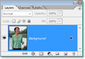
The Layers palette in Photoshop showing the Background layer, which contains the original image information.
To duplicate the Background layer, all we need to do is use the handy keyboard shortcut, Ctrl+J (Win) / Command+J (Mac). If we look again in the Layers palette, we can see that we now have two layers – the original Background layer on the bottom and a copy of it, which Photoshop has automatically named “Layer 1″, on top:

The Layers palette in Photoshop now showing the Background layer as well as a copy of the Background layer above it
We can now safely work on our image without worrying about damaging the original.
Step 2: Select The Object That Needs A Color Change
Using the selection tool of your choice (Lasso Tool, Pen Tool, etc.), draw a selection around the object that needs its color to be changed. Here, we can see my selection outlines around the woman’s top:

Use the selection tool of your choice to select around the object that needs a color change.
Step 3: Select A Large Area Inside The Object In The Second Image
Switch over to your second image at this point and again using your favorite selection tool (the Lasso Tool will work fine for this), select a large area inside the object that contains the color you need. In my case, I’m going to select a large section of the purple top the woman is wearing. There’s no need to make a precise selection around the object, but what you want to do is make a large enough selection so that you’re grabbing as many shades of the color (light and dark areas) as possible. Photoshop needs as many shades of the color as you can give it so it can accurately apply the color to the object in the original image (the buttons on her shirt may or may not cause some problems so I held down my Shift key and dragged around them with the Lasso Tool to subtract them from my selection, just to be safe):

Selecting a large area of the shirt to include as many shades of the color as possible.
Step 4: Switch Back To The Original Image
Now that we’ve selected the object in the first photo and selected a large area of color inside the object in the second photo, we can head over to the Match Color command. Before we do though, we need to make sure that our original photo is the one that Photoshop is currently looking at (the technical term would be to bring the original photo into "focus"), so click anywhere inside the document window of the original image to select it. The Match Color command is going to refer to this original image as the Destination Image, as if the colors from the second image will be taking a trip over to this one, while the second image (the one containing the color we need) will become the Source Image. For now, just make sure the original image is the one currently selected (in focus).
Step 5: Open The Match Color Command
With your original image selected, go up to the Image menu at the top of the screen, choose Adjustments, and then choose Match Color:

Go to Image > Adjustments > Match Color.
This brings up Photoshop’s rather large Match Color dialog box. Now, I love Photoshop. I think it’s the greatest thing since crayons. But quite honestly, between you and me, something just isn’t right about the Match Color dialog box. It’s confusing, and it shouldn’t be. I wish Adobe would redesign it but so far, as of Photoshop CS3, they haven’t, so we’ll just have to cut through the confusion to get to the simplicity underneath.
The Match Color dialog box is divided into two main sections – Destination Image on top, and Image Statistics (say what?) on the bottom. See, you were thinking the bottom section would be called "Source Image", right? I mean, that would make sense. But nope, it’s called "Image Statistics". Let’s just leave the bottom section alone for now and look at the top section, "Destination Image".
The Destination Image is the image containing the colors you want to change. There’s no way to actually set the Destination Image in the dialog box. Photoshop simply assigns whichever image you had selected when you chose the Match Color command from the Image Menu as your Destination Image, which is why I had you select your original image first. My original image is named "green.jpg", and we can see its name listed beside the word "Target" at the top of the dialog box:

The Match Color dialog box showing my “green.jpg” photo as the Destination Image.
Below the Destination Image’s name is the Image Options section, containing options such as Luminance, Color Intensity, Fade, and Neutralize. Common sense might have you believing that since these options are clearly grouped in with the Destination Image section at the top, they have something to do with the Destination Image, but common sense would be wrong. They control the Source Image at the bottom, which you assign down in the Image Statistics section. See what I mean? This dialog box needs some work.
Fortunately, even though the dialog box itself is confusing, what we’re trying to do with it is not. We already have our Destination Image chosen, so now we need to select our Source Image.
Step 6: Select Your Second Image As The Source
Down in the Image Statistics section at the bottom of the dialog box, you’ll see an option named Source with a drop-down box beside it. Click on the small arrow to the right of the drop-down box and choose your second image from the list to set it as your Source image:

Select your second image from the “Source” option drop-down list.
If your Source image contains multiple layers, you’ll need to select the appropriate layer from the Layer option below the Source option. In my case, my second image contains only one layer, the original Background layer, so it’s automatically selected for me.
Step 7: Tell Photoshop To Use The Selections You’ve Made In The Images
Directly above the Source option are two options with checkboxes beside them – Use Selection in Source to Calculate Colors and Use Selection in Target to Calculate Adjustment. The first option tells Photoshop that we want it to use only the colors inside our selection in the Source image when matching the colors to the Destination image. In other words, in my case, I want Photoshop to use only the purple colors I’ve selected inside the woman’s top. If I didn’t make that clear to Photoshop, it would ignore my selection and use colors from the entire photo, which isn’t what we want, so make sure you click inside the checkbox for this option to select it.
The second option says that we want Photoshop to concern itself only with the specific object we selected in our original image when figuring out how to match the colors. In my case, that means I’m telling Photoshop that I only want it to look at the colors that make up the green top the woman is wearing. If I didn’t specify this, Photoshop would take all the colors from the entire photo into consideration and the result wouldn’t be as accurate, so make sure this option is also selected:

Select both the “Use Selection in Source to Calculate Colors” and “Use Selection in Target to Calculate Adjustment” options to tell Photoshop to use only the selected areas in the images when matching the colors.
Click OK when you’re done to exit out of the dialog box and have Photoshop try to match the colors in the Destination image with those from the Source image. In many cases, this works beautifully and no further work is needed. Depending on the images you’re using though, that may not be the case. Sometimes Photoshop doesn’t get it quite right. For me, this is one of those times. Here’s what my original image now looks like (the selection is still visible and active):

The original image after applying the Match Color command.
Photoshop was able to get the basic color right, but there’s definitely something wrong with the overall effect. The problem is that there’s no longer any contrast in the woman’s top. The dark shadow areas are much too light, and any subtle highlight areas have disappeared. Basically, it looks fake. This is one of those times when Match Color needs a little help. I could have tried adjusting the brightness by dragging the Luminance slider in the Image Options section of the Match Color dialog box, but all that would have done is made the entire top lighter or darker. I need to be able to adjust the highlights and shadows independently. Fortunately, it’s easy to do, as we’ll see next!
Step 8: Add A Levels Adjustment Layer
I’m going to use a simple Levels adjustment layer to darken the shadows and brighten the highlights of her top. To do that, click on the New Adjustment Layer icon at the bottom of the Layers palette:

Click on the “New Adjustment Layer” icon at the bottom of the Layers palette.
Then select Levels from the list of adjustment layers that appears:

Choose “Levels” from the list.
Step 9: Drag The Black And White Point Sliders In Towards The Center
When the Levels dialog box appears, you’ll see a large black Histogram (looks like a mountain) in the middle of the dialog box, along with three little sliders below it – a black slider on the far left, a white slider on the far right, and a gray slider in the middle. To darken the shadow areas, simply click on the black slider and drag it towards the right until it’s at the point where the left side of the Histogram begins. Keep an eye on your image as you drag the slider so you can see what’s happening to the shadows and adjust the slider as needed. Then, when you’ve corrected the shadow areas, click on the white slider on the far right and drag it towards the left until it’s at the point where the right side of the Histogram begins. Again, keep an eye on your image as you drag the slider to see what’s happening with your highlights. Photoshop may be a computer program but that doesn’t mean you and I need to think like one. Use the Histogram as a guide but trust your own eyes above all else:

Drag the black and white sliders in towards the Histogram to improve the shadow and highlight areas inside your selection.
Click OK when you’re done to exit out of the Levels dialog box. Your shadows and highlights should now look much better, but chances are you’ve just created a different problem. In my case, the woman’s top now has a much more realistic level of contrast to it, but the overall color has been changed:

The contrast in the woman’s top has been improved, but the color is now different.
Step 10: Change The Levels Adjustment Layer’s Blend Mode To “Luminosity”
The reason for the color shift is that by default, the Levels command makes changes not only to the luminosity (brightness) values of the image but also to the colors. We need to tell Photoshop that we want our Levels adjustment layer to affect only the luminosity values of the object and leave the colors alone. How do we do that? Easy. We simply change the adjustment layer’s blend mode. Go up to the Blend Mode option in the top left corner of the Layers palette. It currently says “Normal”, which is the default blend mode. Click on the small, down-pointing arrow to the right of the word “Normal” and select Luminosity from way down at the very bottom of the list:

Change the blend mode of the Levels adjustment layer from “Normal” to “Luminosity”.
Step 11: Deselect Your Selection
Press Ctrl+D (Win) / Command+D (Mac) at this point to remove your selection from around the object, and you’re done!
Here, after changing the blend mode of the Levels adjustment layer to “Luminosity”, is my final result:

The final result.
And there we have it!
Shaan Graphics is a premier Image Editing service provider, providing this exclusive Retouching and enhancement service with Internationally lowest price guaranteed. Shaan Graphics Image editing service starts from $0.50 only.
Visit www.shaangraphics.com for more details


2 comments:
I have been running a blog within this same topic for merely 2 years now, what I possess often believed is that it needs time to work to be able to overcome with this thing. But when I just read your post, I had been genuinely amazed that there are lots of ways to do it and have and even much better advantages. Photoshop Clipping path is best and low cost service please visit http://www.clippingpathsource.com/ for more information about clipping path.
Wonderful Tutorial, thanks for putting this together! This is obviously one great post. Thanks for the valuable information
Post a Comment