Thursday, November 22, 2012

Basic Model Retouching with Photoshop

For the Tutorial We choose a picture of a beautiful lady

In this first stage we will give more color to the hair and face. First duplicate the Background layer.


Layer > Duplicate Layer - Name it "Blur"


Blur a little: Filter > Blur > Gaussian Blur > Radius = 5 px
Change the layer to Soft Light mode with a 75% transparency. This brings a better definition of the image and recovers the color a little.


Above the Layer Background make a new layer to finish giving life to face.

Layer > New > Layer - Name it "New Color" or whatever you want.

Fill this layer with the color 75,25,25 using the Paint Bucket tool. Then change this layer to Soft Light mode with 75% transparency.


2. - Eyes and Lips...

Up to now really looks very well, however their eyes get lost a little, the same as their lips.

Make a new layer, above the layer "blur", name it "lips".

Layer > New > Layer

Use the Zoom Tool to increase the area of the lips and use a paintbrush of the appropriate size to paint the lips with the same color: 75,25,25.

Begin marking the contour with a thin paintbrush, then fill with a wider one.


Change the layer lips to Soft Light mode and like magic art some succulent lips appear.


As you will see, there is a small clear point in the left corner lips, also another close to the center of the inferior lip, something that seems like a grain.


It is necessary to correct this with the Clone Stamp tool at 50 - 35%. Sampling (pressing the Alt key, and clicking with the mouse) fair to the center of these two imperfections. All this on the Background layer.


The lips are ready, now lets go for the eyes, she will use blue color eyes, blue as the sky to where she belongs.

Make a new Layer above all the other ones. Layer> New> Layer - Name it "eyes "

With the Heliptical Marquee tool make a selection that adjusts around one of her pupils. Go to Selection > Transform Selection to adjust as much as possible to the pupil.
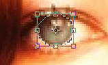


Selects the white color and fill the selection pressing Alt.+ Delete.

Once its full, with the Eliptical Marquee tool drag the selection to the other eye (not in all the cases it is the same diameter) and also fill it.


Deselect by Pressing Ctrl + D.

Then load again the selection, but now of both eyes.

Select > Load Selection - Channel = eyes Transparency

Now its time for color: blue. Image > Adjust > Hue/Saturation - Colorize - Hue = 220 - Saturation = 100 - Lightness = -20


Deselect pressing Ctrl + D. Then take this layer to Soft Light mode and adjust its transparency value if you decide to decrease the color intensity.

And she is Ready.


Shaan Graphics is a premier Image Editing service provider, providing this exclusive glamour retouching service with Internationally lowest price guaranteed. Shaan Graphics Image editing service starts from $0.50 only.

Visit www.shaangraphics.com for more details


Wednesday, November 21, 2012

Photo Retouching – Change Hair Color Photoshop Tutorial

This is the photo we will be starting with :


The first stage is to mask her hair out, to do this, press ‘q’ then select a suitable brush and paint over her hair – don’t worry if you go over the edges we will sort that out later :


Once the hair is covered in the red overlay, press ‘q’ again which will put a selection around the area, then on the menu go to select > inverse and should have something like this :


Create a new layer and then fill the area with the color of your choice, I have chosen to go with a dark red/brown :


Now, right click on the hair layer and select blending options, change the blend mode to soft light :


Thats looks better, but there will be some areas where you went over her hair line/ears etc. Select the eraser brush on a larger feathered size brush and start to clean up those bits :


When you have it looking how you want, duplicate that layer to make the hair shade darker and again you will see some bits which need to be cleaned up with the eraser brush, choose an even larger feathered brush for this (size 65 or 100 for this image) and blend it in a little bit more :


You can also switch between the two hair layers, slowing working on tidying it up so it looks natural – you can also delete bits on top of the hair and the strands to give the impression of blonde highlights. Play about with this untill you get the desired effect, here’s our finished image :


Shaan Graphics is a premier Image Editing service provider, providing this exclusive glamour retouching service with Internationally lowest price guaranteed. Shaan Graphics Image editing service starts from $0.50 only.

Visit www.shaangraphics.com for more details


Monday, November 19, 2012

Changing Hair Color in Pictures

Open up a photograph


Choose a soft edge brush.


Press "Q" to enter in quick mask mode. Then mark the hair area with the brush. You do not have to be very accurate around the edges.


Press “Q” again to leave the quick mask mode.


Now we have a selection around the hair, however we need is the selection in the hair.


To do so, go to Select > Invert.


Now we dye the hair. Create a new Fill Layer by going to:

Layer > New Fill Layer > Solid Color

Under the basic properties of the new fill layer, change the mode to Soft Light, then click OK.

Next you pick the new hair color . For the example, I choose red.


And here is the final Result!


Thursday, November 15, 2012


Final Product What You'll Be Creating


As it’s Graphic Design Week here on Psdtuts+, let’s take a look at some basic Graphic Design principles and cast an eye over the Boxing Poster aesthetic from yesteryear.Creating a retrograde look is nothing new, but there are some things to keep an eye out for when mimicking Graphic Design from any decades past. We’ll be drawing inspiration from Poster Design from the 1960s, particularly Boxing Posters from that era. Let’s get started!


Step 1
As with any design project, you’ll need to decide upon the medium which will carry your message. We’ll keep it simple by creating an A3 canvas, keep in mind that if you are designing for print onto paper or canvas you will more than likely need to set a Bleed and/or Slug Area. This usually ranges from about 3 to 5 mm.


It’s very good practice to sketch out a few ideas before sitting in front of the computer. I know the computer allows for limitless experimentation, but this doesn’t necessarily help find the best solution and can lead to a lot of wasted time without finding a clear outcome.

Step 2
Of course, for this type of project we’ll need old paper stock. Find one that you like or get this one from sxc.hu (cheers to Andrew C for the hook-up on this image). Import the paper into your working document and resize it to fit.


Step 3
As the paper stock is from the 1960′s (not really, but that’s what we’re aiming for), it wouldn’t look quite this ancient so add a couple of Adjustment Layers to sort it out. I used a Levels (Layer > New Adjustment Layer > Levels)…


…and Hue/Saturation (Layer > New Adjustment Layer > Hue/Saturation). It’s worth organizing your Layers palette as you go along, so select all of your Layers and Group them.


Step 4
Now we can start building up the poster design based on the original sketch. This speeds up the process to no-end, but don’t feel locked in to your initial sketch. If you get a better idea once you’re at the computer then go for it.I got two classic Boxers courtesy of Peltz Boxing Promotions, massive thanks to Russell for that. You’ll need to grab some boxers from iStockphoto, or better still, take your own photos.For the sake of this tutorial, I will refer to the Boxers by their Layer names: “MONROE” and “KATES.” Back in the 60′s there were no fancy computers loaded up with expensive software so everything was hand-rendered (cut-and-paste). To honor this, do a rough cut out of your two fighters using the Pen Tool, try to emulate how you’d cut them out by hand.


Step 5
Paste them into the working document and resize them to fit the composition. Balance up the fighters tonally by adjusting the Levels, they need to be similarly exposed. Desaturate both “MONROE” and “KATES” (Image > Adjustments > Desaturate) and finally set the Layer Blending Mode of both layers to Multiply.


Step 6
Go to View > Rulers and turn them on. Drag two rulers down from the the top ruler area and two from the side. I’ve pulled the first horizontal to 224 mm and the next to 305 mm. I pulled the two verticals to 146.6 mm and 147 mm.


Select the Rectangle Tool and set it to Shape Layers instead of Paths. Set the foreground color to #e45050 and draw in two rectangles as shown. It is best to use less saturated colors as very vibrant colors would not have been printable. Then set their Layer Blending Modes to Multiply.


Select the rectangle on the left and go to Edit > Free Transform. Press and hold Command + Shift and then drag the middle point of the Free Transform Bounding Box as shown below. Repeat the process for the other rectangle.


Step 7
We’ll now use the rectangles to mask off the areas of “MONROE” and “KATES” that we don’t need. Select “KATES” and add a Layer Mask. Then Command-click on the right-hand rectangle thumbnail to make a selection from it. Working on the “KATES” Layer Mask, simply fill the selection with black. Repeat this process for “MONROE.”


Back before printing made it’s modern advances, printing wasn’t as accurate and the plates used to make up different colors could – and frequently did – misalign to create overlaps or spaces. We’ll mimic this by unlinking “MONROE” and “KATES” Layer Masks (click the chain link icon between the Layer Thumbnail and Layer Mask thumbnail) and shifting the Layer Masks down using the Move Tool.


Step 8
Now it’s time to start building up text. Block capitals were popular of the time and often overused. They kept things neat and were easier to set. They also have more authority than lower case and suit the nature of the medium and the sport it advertises.Select the Type Tool and click on the canvas. Type in the text shown or make up your own names if it’s more fun. I’ve used BentonSans which is a modern take on the Sans Serif font with some classic touches. The first name should be smaller than the surname, set it up as shown.


Use a Condensed version of the same font to contrast with the first name making it appear grander. Increase the size over that of the first name by around 2.5 times. Open up the Tracking to about 25 and set the Kerning to Metrics.


Rotate the text to match the rectangles you drew, 10.1 degrees should do it. Typesetting in the 1960s wasn’t nearly as accurate as you can do using a computer today. To get an uneven effect we can play about with the Kerning by positioning the Text Tool in between characters. Slightly adjust the Kerning between a couple of letters to make it imprecise.


Do the same process for the opponents name. In the same Condensed font write “Champion” and “Challenger” onto new Layers. They should be smaller than the first names of the Boxers, I’ve made them 32.37 pt compared to 44.31 for the first names and 101.53 for the surname


Step 9
We’ll make a little feature of the “VS” Text by putting it in a circular flash that breaks out of the rectangles. Use the Ellipse Tool (located behind the Rectangle Tool) set to Shape Layers to draw a colored circle. Use the same red as you did for the rectangles in Step 6. Command-click on the “CIRCLE” Layer thumbnail to create a selection and go to Select > Modify > Expand. Expand this by 20 pixels or so.


Select one of your “RECTANGLE” Layer Mask thumbnails and fill your loaded selection with black. Do the same for the other “RECTANGLE” Shape Layer.


Step 10
A hallmark of the 1960s Boxing Poster is the claim that the fight is not available on home theaters or TVs. So draw a black (#0b0c0c, not quite solid black) Circular Shape Layer and stack some text on it. Set the Circular Shaper Layers Blend Mode to Multiply. The text would usually be justified centrally to a definitive width, using character size and width to sure up the sides as opposed to increasing the kerning or tracking.


Step 11
Draw another Rectangular Shape Layer at the top of the poster and set the Layer Blend Mode to Multiply. Use the same black as for the “NO HOME TV” flash.


Draw a red one at the bottom and set it to Multiply. Now add Layer Masks to all of your Rectangular Shape Layers.


Step 12
Select the PAPER Layer and use the Magic Wand Tool to select the white area around the paper.


 Then go through all your Rectangular Shape Layers, selecting the Layer Masks and filling with solid black.


As “MONROE” also breaches the paper edge you’ll need to mask off him as well. You’ll be left with a well worn poster shape.


Step 13
It’s now time to start building up the titles. The posters themselves usually serve up some sensationalism, often billing fights as The Greatest the World has ever seen or other such nonsensical claims. We’ll carry on using Benton (or whichever San Serif font you’ve gone with) for all informational text.To really beef up your text, try adding a Stroke Layer Style (Layer > Layer Style > Stroke) to the text. This does soften the edges and slightly decreases legibility so I wouldn’t recommend doing this for a contemporary poster design.


I’ve added a sponsor to show how to work a title and tagline or standfirst. In this case the tagline is a motto directly linked with the fictional “Grill” of which “Big Al” is the proprietor. The general rule is to use two contrasting types with the title being bigger than the tag, but these rules are constantly being bent.


Try using accent fonts to break up the very square looking block capitals. It’s usually not best practice to use an accent font similar to your body font, so select a Serif or Block-serif to do the job. The whole point of an accent font is to contrast but compliment your body font. I’ve chosen URW Antiqua which is a good display font. Display fonts are less concerned with legibility and more with using type combined with negative space to form relationships between word and images. Getting a strong grasp of typography is massively important in Graphic Design.


Step 14
When working with display type, don’t be scared to manipulate the fonts characteristics to suit your needs. I’m still using Benton (BentonSansCond Black for “Fracas” and “Caracas,” BentonSansExtraComp Bold for “The,” and “In”), but I’ve increased the vertical scale to allow maximum impact.I can’t increase the width of the poster, nor do I want to double stack the text. So too maximize the impact of the title working within a tight space, I increased the Vertical Scale to 116%, I scaled down the article words (words that introduce nouns are called articles) and adjusted the Baseline Shift so they sit in between the important words. I also needed to Shift the Boxers down a touch, again don’t be scared to nudge elements around until they work well together.


Step 15
Create a Layer group called “TICKET/VENUE INFO.” Drag in two vertical guides to mark off the boundaries of where we want the info to go. Making it full-width would detract too much away from the title and boxer names.


Add some Footer text to sit on the red rectangle at the foot of the poster. Now we’ve got a clear and definite space to fill with all the Venue and ticket information. In this space the Date also needs to go in. You need to organize the information in terms of importance. I’m going to prioritize the Date and the Venue.


Drag two horizontal guides from the ruler running across the top to mark your text boundaries. Start building up the date text, note that each part of the text is on its own layer to allow for maximum flexibility. This is a fair example of display text working with the negative space and letterforms to create a more visually dynamic date. Use the Line Tool to draw a 14 pixel line next to the date.


This area is in danger of becoming a very square with dense block capitals. To break up this area, use a more graphic font, in this case a script font called Bello.


There are more ways to avoid an impenetrable clump of block text. Use font weights and vertical/horizontal scaling to your advantage. Highlight important bits of info by making them over-large and using a heavy weight. You could spend a lot of time balancing up this section, but it’s good enough for now.


Step 16
Now that the layout elements are complete, zoom out and look at the composition as a whole. We’re going for a 1960s aesthetic so it’s OK if things don’t line up perfectly. Go to Layer > Rasterize > All Layers. Then systematically apply all the Layer Masks by selecting each one in turn and going to Layer > Layer Masks > Apply.


Step 17
With the composition complete, we’ll begin degrading the image and applying a fake 1960s print finish to it. This is where it gets a little fiddly. Select all of the black shape layers and black text layers and merge them. Call it “BLACKTEXT.” Do the same for all layers containing white text and call the resultant layer “WHITETEXT.”


Do the same for the layers containing red text and finally the same for all red Shape Layers.


Your Layers Palette should resemble mine


Step 18
Apply a 4 pixel Gaussian Blur to “REDTEXT,” “WHITETEXT,” and “BLACKTEXT.”


Then apply a Smart Sharpen at 386% with a 44.3 radius. This process softens the text edges and makes the text look like the ink has been absorbed into the paper a little more. You will need to reapply color #e45050 to “REDTEXT” as the Sharpening has destroyed the color.


Step 19
Turn the “WHITETEXT” Layer visibility off. Then Command-click on its Layer thumbnail to make a selection. Select “BLACKTEXT” and delete the selection, do the same on “REDSHAPES.”


Step 20
Select “REDSHAPES” and apply a 4 pixel Gaussian Blur to it. Then run a Smart Sharpen filter as shown.


Run a second Smart Sharpen with a much bigger Pixel Radius. This gives the impression that ink has gathered at the edges of the print.


Step 21
Select all the Layers except for the “BACKGROUND” group or the “Background” layer itself. Merge the Layers and change the Layer Blend Mode to Multiply. Select the “BACKGROUND” group and press Command + E to merge them onto one layer.You are now ready to grunge it in your favored way. I’ve used Mr Retro Machine Wash Filter 3 on the Dusted setting, but any grunge or dirty brush will do the trick. 
It’s worth mentioning that I lightened the Paper and desaturated a little more.


Conclusion
The final image is below and I hope you enjoyed this tutorial.


Shaan Graphics is a premier Image Editing service provider, providing this exclusive Posters and ad design service with Internationally lowest price guaranteed. Shaan Graphics Image editing service starts from $0.50 only.

Visit www.shaangraphics.com for more details