Wednesday, December 05, 2012

Working With Shadows In Photoshop - Advanced Shadow Techniques


Learn the fine art of isolating and preserving delicate and complex shadows for transplantation to exotic new backgrounds. Mark Galer reveals how to introduce a world of exciting textures to your ever so subtle... not... studio tabletop.


Desert Camelia


                                 Humble beginnings – take one flower, a desk lamp and some white paper.

The flower for this tutorial was photographed (using a Fuji FinePix) on a cold winters morning in Victoria whilst the sand (shot on Kodachrome film) hails from the Great Indian Desert in Rajasthan. Unlikely bedfellows, but with a little craft the two can lie together comfortably within the same frame – but only if the subtle shadow (created by a not-so-subtle 75 watt globe and a couple of pieces of white paper) is captured with all of its subtlety and delicately transplanted to its new home in the desert. This is how...!

Botanical Health Warning: The delicate petals of the flower can be cooked, frazzled or fried by the heat of a tungsten lamp in just a few minutes. Be prepared to work quickly or use soft window light as a low-temperature alternative.


Duplicate the background layer.


Step 1

Duplicate the background layer by dragging the layer to the ‘New Layer’ icon in the layers palette. Don’t worry if the edges of your white paper are in the frame. Just be sure to capture the subject and its shadow.

Note: The surface used does not have to be white, but should be relatively texture-free. This will avoid mismatched textures when the shadow is transported to its new home.


Use the gradient tool in Quick Mask mode.


Step 2
The initial steps in this tutorial aim to reduce the background tone to white and leave the shadows intact. The fall-off of light from the directional light source (the white background gradually becoming grey on the side furthest from the light) can be balanced using an adjustment layer. Select the ‘Default Foreground and Background Colors’, ‘Quick Mask Mode’ and the ‘Gradient Tool’ in the ‘Tools Palette’. Select the ‘Linear Gradient’ and the ‘Foreground to Transparent’, or ‘Foreground to Background’ option in the ‘Options’ bar. Drag a gradient from the brighter side of the image to the darker side of the image. A gradient in the default masking color will appear. Exit Quick Mask mode to reveal the resulting selection.

Alternative approach for Photoshop and Elements users > Adobe Elements users should proceed to the next step and create a gradient directly in the Layer Mask.


Use a levels adjustment layer to balance the background tonality.

Step 3
From the base of the layers palette select a ‘Levels’ adjustment layer. The active selection will create a layer mask for the adjustment layer. Move the central ‘Gamma’ slider and/or highlight slider to the left to brighten the background so that both sides of the background are of a similar tone. Be careful not to loose the shadows in this process. Select ‘OK’ when a satisfactory balance has been achieved.


Select the subject without its shadow. A graphics tablet can help to make light work of this task.

Step 4
Use the painting tools in ‘Quick Mask Mode’ to make a selection of the flower on the background layer (Elements users should use the ‘Selection Brush Tool’ and select the ‘Mask’ mode in the options bar). Remember to feather the selection appropriately or apply a small amount of ‘Gaussian Blur’ to the mask. Click on the layer mask icon in the layers palette to apply a layer mask to the background copy layer (if using Elements the selection can be used to delete the background on this layer). 

Note: A graphics tablet can be used to make light work of tricky selections such as the one performed in this demonstration tutorial.


                 Drag the background copy layer to a position above the levels adjustment layer.

Step 5
Drag the background copy layer to a position above the levels adjustment layer. This will ensure the adjustment layer created in the previous step does not affect your subject.


Use a ‘Threshold’ adjustment layer to render all pixels below the flower black.

Step 6
From the ‘Create new fill or adjustment layer’ menu in the layers palette select ‘Threshold’. This threshold adjustment layer will help in the process of isolating the subtle shadows and enable us to drop the remainder of the background to pure white (255). The first step is to temporarily render all of the pixels below the flower on the top layer black. This is achieved by dragging the slider all the way to the right – a threshold level of 255. Select ‘OK’ to exit the threshold dialog box. 

Note: Check the positioning of the layers in the layers palette if your own result does not match that achieved in the tutorial.


           Move the Gamma and Highlight sliders to render the grey tones of the background paper white.

Step 7
Move the ‘Gamma’ and ‘Highlight’ sliders to render the grey tones of the background paper white. The shadows should now appear clearly defined. Unless the background is blemish free and very evenly lit not all of the background will be rendered white by this step. Have no fear the whitewash step follows.


                            Paint out any remaining dark areas that are not part of the subjects shadow.

Step 8
Select the ‘Paintbrush’ in the ‘Tools Palette’ and click on the ‘Switch Foreground and Background Colors’ icon so that White is now the foreground color. Now paint out anything that is not a shadow.

Note: If the thought of painting directly onto the background layer is not something you are comfortable with then either duplicate the background layer again or take comfort in the fact that you already have another ‘unadjusted layer on top’ as your insurance policy.


Import a new background.

Step 9
The threshold layer has now served its purpose and its visibility can be switched off, or the layer deleted by dragging it to the trash icon in the layers palette. When the threshold is removed from the equation the background will appear white and the subtlety of the shadows will reappear. The coast is now clear for the introduction of the new background. Open the new background file and drag its thumbnail from the layers palette into the window of your work-in-progress file. Hold down the Shift key as you let go of the file to centre it in the host canvas. The new background will appear above the modified background layer for the moment.


Link the background layer and its associated adjustment layers to create a ‘clipping’ group.

Step 10
The next step involves moving the old background to a position above the new background. Start by linking the old background layer with its associated adjustment layers (click on the boxes next to the eye icons on each of the layers). Then go to the Layer menu and select ‘Create Clipping Mask From Linked’ command (‘Group Linked’ in Adobe Elements). This action will ensure the new background remains unaffected when the adjustment layers are moved up in the layers palette in the next step.


Rename the background layer and move to a position above the imported background.

Step 11
Double-click the background layer to change its name. When the layer no longer carries the name ‘background’ it can be moved up the layers stack by clicking and dragging it to a position the new background. The linked layers should accompany it on its travels. The new background will momentarily be replaced with the old white background once again.
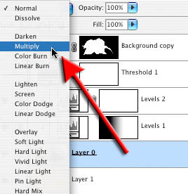


Adjust the blend modes for the old background layer and the adjustment layers.


Step 12
The final step merges or blends the subtle shadows into their new home. Select the old background layer and change its blend mode to Multiply (click on the blend mode menu in the layers palette next to the opacity control). Set the adjustment layers to Luminosity mode if you need to reduce any color that has been introduced from the old background. Add a further Hue/Adjustment layer to this clipping group if additional desaturation is required.


Fade the background and/or create a subtle vignette using adjustment layers and the gradient tool to complete the project.

Step 13
Finishing touches to this project could include the addition of a very subtle vignette, lightening the background as it fades into the distance and the usual sharpening process prior to printing. If an additional adjustment layer gets accidentally grouped with the Clipping group go to the layer menu and select ‘Release Clipping Mask’ command.


Subtle Shadows – courtesy of the shadow catcher technique.

This technique provides those photographers burdened with a meticulous eye a useful way of retaining and transplanting the subtle and complex shadows from the original image to create sophisticated and professional montages. 


Shaan Graphics is a premier Image Editing service provider, providing this exclusive glamour retouching service with Internationally lowest price guaranteed. Shaan Graphics Image editing service starts from $0.50 only.

Visit www.shaangraphics.com http://www.shaangraphics.com for more details


Tuesday, December 04, 2012

Nesting Smart Objects for Multimask Effects in Photoshop


One of the biggest drawbacks to smart filters is that all filters applied to a single layer must share a common filter mask. Fortunately, there’s a workaround. To make a long story short, you nest one smart object inside another. To keep the long story long, read the following steps, in which I’ll employ a total of four smart filters—two masked, two not—to both smooth and sharpen the detail in a photograph.


1 OPEN THE IMAGE TO BE SHARPENED
Let’s start things off with a photograph that requires sharpening. I captured this image with a Leica D-Lux 3 out the window of my car. In the course of touring the back roads of South Dakota’s Black Forest, we were suddenly surrounded by a few hundred mostly peaceful bison, and this guy in particular was close enough to touch (were I endowed with really stretchy Mr. Fantastic arms). The resulting image is soft with striated noise patterns and wandering colors. If I just set about sharpening him, I’d bring out the bad detail along with the good. Fortunately, smart objects provide a more selective if somewhat laborious approach.


2 CONVERT LAYER TO A SMART OBJECT
Photoshop provides a handful of commands that convert an image to a smart object. But for my money, the most convenient method is to click the little doodad in the top-right corner of the Layers panel and choose Convert to Smart Object. (It works for multilayer images, too.) Go ahead and rename the new layer something meaningful like “Bison.” Now your converted and named image is ready to receive nondestructive smart filters.


3 APPLY SMART SHARPEN
To sharpen the creature, choose Filter>Sharpen>Smart Sharpen. Then set the Amount to 350%, Radius to 4.0 pixels, and Remove to Lens Blur. After clicking OK, double-click the tiny slider icon to the right of the words “Smart Sharpen” in the Layers panel and change the Mode setting to Luminosity. This focuses the attention on the detail in the image rather than exaggerating the discrepancies between color channels—always a good idea when sharpening. Leave the Opacity set to 100% and click OK. Tip: Delete the empty filter mask because it just takes up room. When you do need a mask, it’s easier to create it on the fly, as you’ll soon see.


4 SMOOTH COLOR WITH MEDIAN
Sharpening did my bison some good, but it also brought out anomalous color patches in the fur. What’s needed is a generous pass of the Median filter. Choose Filter>Noise>Median, raise the Radius to a hefty 50 pixels, and click OK. As a rule, smoothing should be applied before sharpening so drag the Median filter below Smart Sharpen in the Layers panel. Double-click the slider icon to the right of “Median” in the Layers panel. (Photoshop warns you that you won’t be able to preview the effects.) Change the Mode to Color to smooth over the considerable coloring problems, and click OK to render the smoothing and sharpening effects together.


5 FIND BEST CHANNEL TO USE FOR MASK
Smoothing out the color works nicely inside the bizarrely (and inaccurately) multicolored bison, but it eliminates all hint of color in the background. What’s needed is a filter mask that exposes the bison and protects the grass. Turn off the Eye icon in front of the words “Smart Filters” in the Layers panel to restore the original image, which we’ll need to build a mask. Click the Channels tab and click the various channels to find the one with the highest degree of contrast between foreground and background. For most people and mammal shots, this is going to be Red.


6 EXAGGERATE CONTRAST IN CHANNEL
Duplicate the Red channel by dragging it onto the Create New Channel icon at the bottom of the panel. Double-click the name (in our case, Red copy) and call it “Mask.” When the mask is complete, the bison should be white and the background black. So press Command-I (PC: Ctrl-I) to invert the colors. Next we need to exaggerate the contrast. Choose Image>Adjustments>Levels. Raise the black point value to 70 and lower the white point value to 190 to draw out the bison from its background. Click OK to complete the effect.


7 LOAD THE MASK AS A SELECTION
Your mask isn’t going to win any awards for accuracy. And if you have some extra time on your hands, you could finesse it using the Dodge and Burn tools or the like. But this quick-and-dirty mask nicely highlights the areas of major color drift and fur detail, making it good enough for our purposes. To load the mask, press the Command key (PC: Ctrl) and click the Mask thumbnail in the Channels panel. Now you’re ready to apply the mask to the filters.


8 OPEN THE IMAGE TO BE SHARPENED
Click the RGB thumbnail in the Channels panel to return to the color composite image. Then click the Layers tab to return to the Layers panel. Turn on the Eye icon in front of the words “Smart Filters.” Then Control-click (PC: Right-click) “Smart Filters” and choose Add Filter Mask. Photoshop limits the Median and Smart Sharpen effects to the interior of the bison and protects the prairie grass in the background.


9 DELETE UNUSED CHANNEL
One of the great things about smart objects is that they make efficient use of file size. This particular image was 15.4 MB flat and 15.4 MB after the addition of the two nondestructive smart filters. It’s only when you start adding masks that the file size balloons. We have two masks, one alpha channel and the other a filter mask, so the file size has grown to 25.7 MB. The two masks are identical, so there’s no reason to keep them both. Go to the Channels panel and drag the Mask channel (not the italicized Filter Mask item) to the Trash. The file size drops to 20.5 MB.


10 OPEN SMART OBJECT IN NEW WINDOW
I’m glad to have brought back the colors in the grass. But I’m not so keen on limiting the sharpening effect to the animal. Plus we need to address the horizontal noise patterns at work in the shadow detail. This means applying a couple more filters, neither of which benefit from the existing filter mask. The solution is to 
create a nested smart object—a smart object inside a smart object—to accommodate the unmasked filters. Back inside the Layers panel, double-click on the Bison smart object thumbnail to open it in a new window (presumably called Layer 01.psb after the temporary file Photoshop creates to accommodate the smart object).


11 CONVERT SMART OBJECT TO SMART OBJECT
You’ll see the original, unedited version of the photograph on a standard Background layer, with all pixels available for editing. Bring up the Layers panel menu and once again choose Convert to Smart Object. Then rename the layer “You’re in the SO!” This way you’ll know where you are if you accidentally enter the smart object. While this adds to the complexity of the file, quite amazingly, it adds nothing to the file size. In fact, the Adobe engineers I talked to endorse this technique and told me there is currently no limit to how deeply you can nest smart objects.


12 APPLY REDUCE NOISE
To downplay the striated noise pattern, choose Filter>Noise>Reduce Noise. Then change the Strength value to 8, Preserve Details to 20%, Reduce Color Noise to 15%, and Sharpen Details to 0%, all of which conspire to smooth away most of the noise without altogether ruining the good detail. Make sure the Remove JPEG Artifact checkbox is turned off and then click OK to apply the filter.


13 APPLY HIGH PASS FOR EDGE CONTRAST
You don’t need the filter mask so drag it to the Trash in the Layers panel. Next we want to add a little bit of edge contrast, in part to sharpen the prairie grass but also to generally enhance the image detail. Choose Filter>Other>High Pass, set the Radius value to 20 pixels, and click OK. Double-click the tiny slider icon to the right of the words High Pass in the Layers panel. Drop out the grays by changing the Mode setting to Soft Light. Then reduce the Opacity value to 50% and click OK. The result is just enough sharpness to offset the effects of the Reduce Noise filter.


14 ENJOY THE RESULTS AND FLEXIBILITY
Close and save the nested smart object. Moments later, you’ll see the meticulously sharpened result thanks to a combination of four filters working nondestructively aided by two smart objects, one nested inside the other. It takes some effort to sharpen an image with this degree of control and accuracy, but the results are worth the effort. And you can modify the filter settings without fear of harming the quality of the image. Smart objects aren’t perfect, but with some planning and slightly more patience, you can establish flexible compositions that permit you to apply filters and adjust their order and settings in any way you see fit.


Shaan Graphics is a premier Image Editing service provider, providing this exclusive glamour retouching service with Internationally lowest price guaranteed. Shaan Graphics Image editing service starts from $0.50 only.

Visit www.shaangraphics.com http://www.shaangraphics.com for more details


Monday, December 03, 2012

Enhance Your Image with Selective Color Adjustments


In this tutorial, I will show you a nondestructive process for color-editing and retouching photographs. These techniques will make your images “finished” and professional. My main weapon is the Selective Color adjustment layer. Let’s get started.


Step 1
Below is our starting image of a couple on a beach. We also need to download a photo of a beach that we’ll use to improve the water and sky in the base image. We’ll see this second image later in this tutorial and in the PSD download available for Plus members.


Step 2
First, the base photograph looks washed out. It just isn’t that interesting. Who wants to visit this boring beach? We’ll be fixing that. Regardless of what I’m working on, I always separate the foreground subject matter from the background. Most times, I use the Extract Filter located in the Filters Menu. Extract is easy to use. More often than not, it does a good job of isolating your subject. Make a copy of the base layer. Place it on top of the original. Hide it. Then open up the Extract Filter.


Step 3
Using the Extract Filter, trace the subject. Then use the Fill Bucket to fill in the area you want to keep. When using the extract filter on complex details like hair, remember to outline the whole problem area so there is definite ink overlap where the detail starts and ends. Otherwise, Photoshop has trouble calculating what to
remove. Notice on the hair area, there is good overlay on the sky portion as well as the man’s head.
First, I extracted the people. Later on, I moved the umbrella portion to its own layer (easier for me to keep track of, but that’s optional).


Step 4
After a successful extraction, there’s still some touch-up that needs to be done. Using the History Palette, set the state you want the History Brush to go back to. We want to paint back the duplicated layer before we extracted it.


Step 5
Zoom in tight and you will see some artifacts that weren’t extracted correctly. Sometimes there’s too much background showing. Or there’s foreground that was extracted by mistake. Using the History Brush(Y) and the Eraser Tools, paint back in the foreground and Erase(E) the extra background.

Remember to change the softness of your brushes to match the outline of your subject. Use a harder brush when the edges are sharper. Use a softer brush when you are in an unfocused area of the subject. That’s how you keep it realistic.

Turn the visibility of the original photo back on after touching up the whole outline of the subject. You now have a perfectly separated foreground object on top of your background.


Step 6
OK, now that our foreground is on top of everything else, let’s do something about that sky and ocean. Rather than using separate images for the sky and ocean, I found an image that will be used to replace both. I happened to find a clouded sky image that also had a good saturated ocean as well.


Step 7
Paste the new sky image on a new layer beneath the extracted foreground. Line up the original ocean line with the new ocean line. Create a layer mask on the new sky image layer. Use the Gradient Tool (using a black to white gradient fill) to affect the layer mask. Create a gradual fade between the base image and the new sky image. Your result should look like the second image below.


Step 8
All right, the new sky and ocean look pretty good. But now the sand looks too washed out. Let’s pump it up. Most of the time, I use Selective Color instead of Hue/Saturation. You get better fine tuning and less artifacts that way.

Enter the quickmask area (the button for it is located at the bottom of the tools palette). Now everything you paint or fill is treated as a selection. The painted part is the unselected area. Use the Gradient Tool to fill the quick mask from the edge of the water line to the sand. Exit the quick mask. Now you have a selection that is gradated from 100 percent selected to 0 percent selected. In other words, you have a nice selection of the sand area.


Step 9
Now use the Layers Palette and add a new adjustment layer. When you create an adjustment layer, whatever was selected turns into a layer mask for that adjustment layer. Select Selective Color from the adjustment layer menu located at the bottom of the layers palette. Since this area is fairly neutral, we’ll be using the colors white, neutrals, and blacks. See below for the exact values. Notice I’ve used the Relative method. That adds and subtracts color from the source in proportion to how much of that color is present in the source pixels. This gives more natural effects. If you use Absolute, it adds the percentage you specified regardless of how much of that color was already present in the image.


Step 10
Let’s check how our layers and images look at this point by viewing the images below.


Step 11
We’re looking pretty good. One last big thing: that umbrella, very washed out, and a blue umbrella on a blue sky is not the best choice. Let’s make it pop by making it orange. First, isolate the light blue parts. Since the shapes were pretty simple, I used the Polygonal Lasso Tool. You can also create paths, use the quick mask 
feature, or even use extract like we did earlier in this tute. Doesn’t matter how you do it, just get a selection of the blue parts of the umbrella shade.I’ve selected the light blue areas. Now they are isolated. Let’s create another Selective Color adjustment layer. See below for the exact values I used. Unlike the hue/saturation adjustment, you can make really broad color shifts without a lot of the artifacts and overly saturated pixels showing up.


Step 12
Since I maxed out the blacks in the neutral color channels, I decided to use yet another selective color adjustment layer in order to bump the contrast a little more. Press Command and Click the layer mask of the umbrella’s selective color adjustment layer. That will turn the mask into a selection. Make a new selective color adjustment layer. You just need to bump the black up in the neutral channel to darken it down a bit.


Step 13
From here on out, it’s the fine details that really make an image appear finished. The chairs’ fabric backs need some pumping up. That can be accomplished the same way as with the umbrella by using our new friend the selective color adjustment layer. The woman has some back fat sticking out. That’s not attractive. Let’s get rid of that in a nondestructive way.

With the foreground layer selected, lasso the woman’s arm. Press Command+J. That puts the selection on its own layer. Now you can clone, stretch, and manipulate the 
new copy without destroying any of the original pixels. Same with the man’s face; he’s got some 5 o’clock shadow. Overall, his face is a too dark. Lasso it, copy it to a new layer, and experiment away.


Conclusion
That’s it! This process is how I start all of my photo-editing projects. We spent the time in the beginning to isolate the foreground subjects on their own layer. A lot of our masks are very simple to make. You’ll also notice that I haven’t touched any of the original base photo pixels. These nondestructive techniques make it easy to go backwards or start over.


Shaan Graphics is a premier Image Editing service provider, providing this exclusive glamour retouching service with Internationally lowest price guaranteed. Shaan Graphics Image editing service starts from $0.50 only.

Visit www.shaangraphics.com http://www.shaangraphics.com for more details


Saturday, December 01, 2012

Matching Colors Of Objects Between Photos With Photoshop


In this Photoshop tutorial, we’ll learn how to match the color of an object in one photo with the color of an object in a separate photo using the Match Color command, which has been available in Photoshop since Photoshop CS (which means you’ll need at least Photoshop CS if you wish to follow along with this tutorial).

Here I have an image, taken from a catalog, of a model who’s obviously quite happy with how well the color of her new top matches the outdoor setting she finds herself in:

The original image.

As with most items of clothing, that same top is also available in other colors. For example, let’s say it’s also available in the same color as the top the model is wearing in this photo:

A model displaying a purple top.
The client would like you to change the color of the woman’s top in the first photo so that it matches the color of the top in the second photo, like so:

The color of the woman’s top in the original photo has been matched to the color of the top from the second photo.

Personally, I like the green color better, but hey, whatever the client wants, right?

Photoshop’s Match Color command was created specifically for this type of task, although it does have plenty of other uses as well which we’ll look at in other tutorials. However, depending on the images you’re using, Match Color doesn’t always work perfectly on its own. Sometimes it does, sometimes it doesn’t. Sometimes, it needs a little help, and as we’ll see in a moment, this is one of those times. Let’s get started!


Step 1: Duplicate The Background Layer In The Original Image

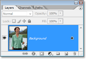
The first thing we always want to do when working on an image in Photoshop is duplicate the Background layer. The Background layer contains our original image information and we don’t want to lose it in case we need to fall back on it. Currently, my Layers palette is showing that my Background layer is the only layer I have: 
The Layers palette in Photoshop showing the Background layer, which contains the original image information.


To duplicate the Background layer, all we need to do is use the handy keyboard shortcut, Ctrl+J (Win) / Command+J (Mac). If we look again in the Layers palette, we can see that we now have two layers – the original Background layer on the bottom and a copy of it, which Photoshop has automatically named “Layer 1″, on top:

The Layers palette in Photoshop now showing the Background layer as well as a copy of the Background layer above it

We can now safely work on our image without worrying about damaging the original.


Step 2: Select The Object That Needs A Color Change

Using the selection tool of your choice (Lasso Tool, Pen Tool, etc.), draw a selection around the object that needs its color to be changed. Here, we can see my selection outlines around the woman’s top:

Use the selection tool of your choice to select around the object that needs a color change.

Step 3: Select A Large Area Inside The Object In The Second Image
Switch over to your second image at this point and again using your favorite selection tool (the Lasso Tool will work fine for this), select a large area inside the object that contains the color you need. In my case, I’m going to select a large section of the purple top the woman is wearing. There’s no need to make a precise selection around the object, but what you want to do is make a large enough selection so that you’re grabbing as many shades of the color (light and dark areas) as possible. Photoshop needs as many shades of the color as you can give it so it can accurately apply the color to the object in the original image (the buttons on her shirt may or may not cause some problems so I held down my Shift key and dragged around them with the Lasso Tool to subtract them from my selection, just to be safe):

Selecting a large area of the shirt to include as many shades of the color as possible.

Step 4: Switch Back To The Original Image
Now that we’ve selected the object in the first photo and selected a large area of color inside the object in the second photo, we can head over to the Match Color command. Before we do though, we need to make sure that our original photo is the one that Photoshop is currently looking at (the technical term would be to bring the original photo into "focus"), so click anywhere inside the document window of the original image to select it. The Match Color command is going to refer to this original image as the Destination Image, as if the colors from the second image will be taking a trip over to this one, while the second image (the one containing the color we need) will become the Source Image. For now, just make sure the original image is the one currently selected (in focus).

Step 5: Open The Match Color Command
With your original image selected, go up to the Image menu at the top of the screen, choose Adjustments, and then choose Match Color:

Go to Image > Adjustments > Match Color.

This brings up Photoshop’s rather large Match Color dialog box. Now, I love Photoshop. I think it’s the greatest thing since crayons. But quite honestly, between you and me, something just isn’t right about the Match Color dialog box. It’s confusing, and it shouldn’t be. I wish Adobe would redesign it but so far, as of Photoshop CS3, they haven’t, so we’ll just have to cut through the confusion to get to the simplicity underneath.

The Match Color dialog box is divided into two main sections – Destination Image on top, and Image Statistics (say what?) on the bottom. See, you were thinking the bottom section would be called "Source Image", right? I mean, that would make sense. But nope, it’s called "Image Statistics". Let’s just leave the bottom section alone for now and look at the top section, "Destination Image".

The Destination Image is the image containing the colors you want to change. There’s no way to actually set the Destination Image in the dialog box. Photoshop simply assigns whichever image you had selected when you chose the Match Color command from the Image Menu as your Destination Image, which is why I had you select your original image first. My original image is named "green.jpg", and we can see its name listed beside the word "Target" at the top of the dialog box:

The Match Color dialog box showing my “green.jpg” photo as the Destination Image.


Below the Destination Image’s name is the Image Options section, containing options such as Luminance, Color Intensity, Fade, and Neutralize. Common sense might have you believing that since these options are clearly grouped in with the Destination Image section at the top, they have something to do with the Destination Image, but common sense would be wrong. They control the Source Image at the bottom, which you assign down in the Image Statistics section. See what I mean? This dialog box needs some work.

Fortunately, even though the dialog box itself is confusing, what we’re trying to do with it is not. We already have our Destination Image chosen, so now we need to select our Source Image.


Step 6: Select Your Second Image As The Source
Down in the Image Statistics section at the bottom of the dialog box, you’ll see an option named Source with a drop-down box beside it. Click on the small arrow to the right of the drop-down box and choose your second image from the list to set it as your Source image:

Select your second image from the “Source” option drop-down list.

If your Source image contains multiple layers, you’ll need to select the appropriate layer from the Layer option below the Source option. In my case, my second image contains only one layer, the original Background layer, so it’s automatically selected for me.

Step 7: Tell Photoshop To Use The Selections You’ve Made In The Images

Directly above the Source option are two options with checkboxes beside them – Use Selection in Source to Calculate Colors and Use Selection in Target to Calculate Adjustment. The first option tells Photoshop that we want it to use only the colors inside our selection in the Source image when matching the colors to the Destination image. In other words, in my case, I want Photoshop to use only the purple colors I’ve selected inside the woman’s top. If I didn’t make that clear to Photoshop, it would ignore my selection and use colors from the entire photo, which isn’t what we want, so make sure you click inside the checkbox for this option to select it.

The second option says that we want Photoshop to concern itself only with the specific object we selected in our original image when figuring out how to match the colors. In my case, that means I’m telling Photoshop that I only want it to look at the colors that make up the green top the woman is wearing. If I didn’t specify this, Photoshop would take all the colors from the entire photo into consideration and the result wouldn’t be as accurate, so make sure this option is also selected:

Select both the “Use Selection in Source to Calculate Colors” and “Use Selection in Target to Calculate Adjustment” options to tell Photoshop to use only the selected areas in the images when matching the colors.

Click OK when you’re done to exit out of the dialog box and have Photoshop try to match the colors in the Destination image with those from the Source image. In many cases, this works beautifully and no further work is needed. Depending on the images you’re using though, that may not be the case. Sometimes Photoshop doesn’t get it quite right. For me, this is one of those times. Here’s what my original image now looks like (the selection is still visible and active):

The original image after applying the Match Color command.

Photoshop was able to get the basic color right, but there’s definitely something wrong with the overall effect. The problem is that there’s no longer any contrast in the woman’s top. The dark shadow areas are much too light, and any subtle highlight areas have disappeared. Basically, it looks fake. This is one of those times when Match Color needs a little help. I could have tried adjusting the brightness by dragging the Luminance slider in the Image Options section of the Match Color dialog box, but all that would have done is made the entire top lighter or darker. I need to be able to adjust the highlights and shadows independently. Fortunately, it’s easy to do, as we’ll see next!

Step 8: Add A Levels Adjustment Layer

I’m going to use a simple Levels adjustment layer to darken the shadows and brighten the highlights of her top. To do that, click on the New Adjustment Layer icon at the bottom of the Layers palette:

Click on the “New Adjustment Layer” icon at the bottom of the Layers palette.


Then select Levels from the list of adjustment layers that appears:

Choose “Levels” from the list.

Step 9: Drag The Black And White Point Sliders In Towards The Center

When the Levels dialog box appears, you’ll see a large black Histogram (looks like a mountain) in the middle of the dialog box, along with three little sliders below it – a black slider on the far left, a white slider on the far right, and a gray slider in the middle. To darken the shadow areas, simply click on the black slider and drag it towards the right until it’s at the point where the left side of the Histogram begins. Keep an eye on your image as you drag the slider so you can see what’s happening to the shadows and adjust the slider as needed. Then, when you’ve corrected the shadow areas, click on the white slider on the far right and drag it towards the left until it’s at the point where the right side of the Histogram begins. Again, keep an eye on your image as you drag the slider to see what’s happening with your highlights. Photoshop may be a computer program but that doesn’t mean you and I need to think like one. Use the Histogram as a guide but trust your own eyes above all else:

Drag the black and white sliders in towards the Histogram to improve the shadow and highlight areas inside your selection.

Click OK when you’re done to exit out of the Levels dialog box. Your shadows and highlights should now look much better, but chances are you’ve just created a different problem. In my case, the woman’s top now has a much more realistic level of contrast to it, but the overall color has been changed:

The contrast in the woman’s top has been improved, but the color is now different.

Step 10: Change The Levels Adjustment Layer’s Blend Mode To “Luminosity”

The reason for the color shift is that by default, the Levels command makes changes not only to the luminosity (brightness) values of the image but also to the colors. We need to tell Photoshop that we want our Levels adjustment layer to affect only the luminosity values of the object and leave the colors alone. How do we do that? Easy. We simply change the adjustment layer’s blend mode. Go up to the Blend Mode option in the top left corner of the Layers palette. It currently says “Normal”, which is the default blend mode. Click on the small, down-pointing arrow to the right of the word “Normal” and select Luminosity from way down at the very bottom of the list:

Change the blend mode of the Levels adjustment layer from “Normal” to “Luminosity”.


Step 11: Deselect Your Selection

Press Ctrl+D (Win) / Command+D (Mac) at this point to remove your selection from around the object, and you’re done!
Here, after changing the blend mode of the Levels adjustment layer to “Luminosity”, is my final result:

The final result.

And there we have it!

Shaan Graphics is a premier Image Editing service provider, providing this exclusive Retouching and enhancement service with Internationally lowest price guaranteed. Shaan Graphics Image editing service starts from $0.50 only.

Visit www.shaangraphics.com for more details